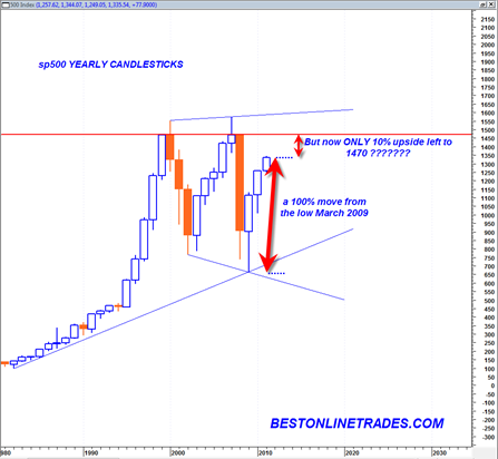
The yearly candlestick chart of the sp500 is indeed one of the most powerful technical analysis charts in the current multi decade time frame. The yearly time frame is the maximum time frame in technical analysis and identifies massive bull or bear markets and massive support and resistance levels.
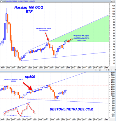
What we can see from the current yearly sp500 candlestick chart is that the sp500 has been trading in a massive trading range since the year 2000. Before the year 2000 was a raging bull market in equities, a slow and normal trending market. That was the mega bull future generations will look at in total awe.
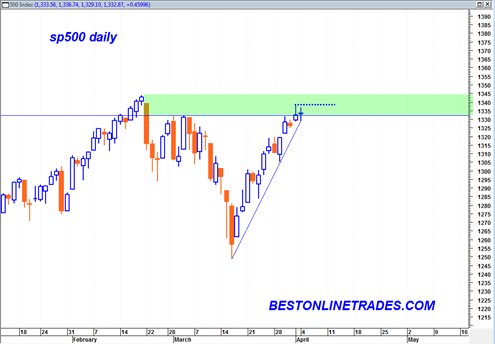
But since 2000 the market has been in a highly volatile trading range state. We see now that the sp500 has been trading the last 3 years (including this year) in an upward recovery trajectory.
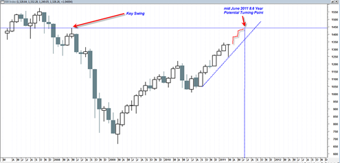
For longer term purposes I think it is very prudent to look at the context of the sp500 now within this large trading range. The fact is that since the March 2009 low of 666 in the sp500 the sp500 has traded higher until today on the order of 100%. That is a huge move.
The percentage move from the LOW of 2009 to the HIGH of 2009 was about 70%. The percentage move from the LOW of 2010 to the HIGH of 2010 was about 25%.
Currently the LOW of 2011 is 1249. A move to 1470 would be about 17.5%. But a move from the current level of today to 1470 is only about 10%.

