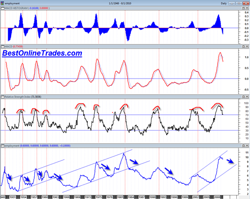
Here is the RSI And MACD Unemployment Rate Chart again. It is missing tomorrows data point which is unlikely to change it that much since the data only comes out on a monthly basis. Still this chart provides some sense of perspective on the much watched data point.
A lot of traders sit on the edge of their seats trying to figure out how the jobs report is going to influence the market. And they should because often times the jobs report can move the market in a big way either up or down.
The problem is that the jobs number is only 1 data point. Perhaps traders remember generally what the previous data points were in past months, but generally speaking it can be very difficult to make any firm conclusions unless there is some type of chart that describes a trend or a behavior of the data.
Here is the chart again of the monthly unemployment data points going back to early 1950’s. One can see that the unemployment rate tended to have sharp upward thrusts that depict a rapid deterioration in the economy. But then in most cases in the past it tended to form a ‘mountain peak’ were the unemployment rate eventually moderated and then gradually improved.
The RSI of the unemployment rate is interesting when it approaches back to the 70 percentile line after a previous break above the 70 line. Break downs below the 70 line have correlated with an improving jobs picture. But again, because the data is only delivered monthly, it takes a very long time for this type of chart to show a real signal.
Right now I can see that the momentum has peaked and that RSI seems perched right above the 70 percentile line. We can either bounce up off this line or start to break below it.
The chart seems to be indicating that the unemployment rate will gradually moderate over the next 1 to 2 years perhaps into the 7% unemployment level rate.


The real unemployment rate…which will probably go unreported on CNBC tomorrow morning
http://www.gallup.com/poll/143426/Gallup-Finds-Unemployment-September.aspx
yea ed I saw that from my stocktwits twitter feed… amazing it does not get more coverage…
So why do analyze bogus data? I did statistics for years and could twist anything any which way my client wanted. How about that??? Does anyone care to be frank, up front or tell it like it is? Or is it day after day of BS?
Well it could be that even if I used a different data set the interpretation may be somewhat similar despite the skew. But I don’t know what other data series to use that goes back far enough.