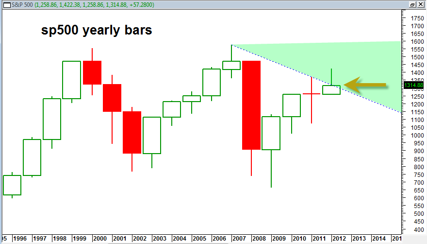
Below is the updated S&P 500 Yearly price candlestick chart.

This is a very important chart to me because it shows that the yearly 2012 price candlestick bar is trying to break out north from the 2007 blue dotted down trend line. This is a yearly chart so it clearly moves in extreme slow motion. Still it is clear that price movement into the green shaded zone will signify a yearly price breakout from 2007 bear market resistance.
If we get sp500 values 1330 or higher as I expect we will then it will show the sp500 is pushing higher into this long term breakout zone again and NOT being rejected at the blue down trend line.
