I have three important charts to share with you that could help to clarify where we are and where we might be going. These charts are pretty much self explanatory but I still believe they illustrate important points or guideposts if you will for future market action. The first is the S&P500.
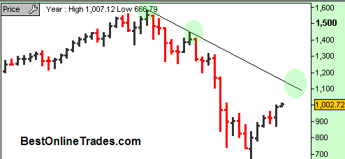
You probably know already what I am going to say with respect to this chart. It is the monthly chart and it shows the powerful move up in July and now the follow through bar for August. Clearly the August bar is just beginning but you can see we seem to be on a mission to the down trendline of the bear market that started in late 2007. Now before I say anything more about the S&P500, lets look at the other two charts first.

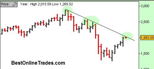
This next chart is the monthly chart of the nasdaq composite index. Note just by looking at this chart you can make the conclusion that the nasdaq composite has been the ‘lead sled dog’ if you will. It has led in terms of price advance and also been the first to achieve a spot right along and under the bear market force that is represented by the long term down trendline.
This is important because this level clearly is a significant resistance level because of the amount of time it has been in force and the fact that it has already been touched twice.
Now one would expect that the S&P500 should also be able to move up right under its down trendline similar to the way the nasdaq has. But the SP500 is already quite far behind and if we are to assume that the SP500 will be able to get back up to its down trendline, then what will happen to the nasdaq during that time ?
It has me thinking that the nasdaq composite is going to be able to break up and through this down trendline before the S&P500 does and be a leading indicator for breakouts worldwide across many other indices. Usually on the third attempt, price is able to succeed in breaking through a resistance line. Not always, but it is more probable in what I have seen over the years. But we really cannot pre judge the market too much before it actually accomplishes this break.
You have seen me recently write about how plentiful breakouts are right now on individual stocks. I have highlighted a good handful of them in recent posts over the last few weeks.
But I can tell you with zero doubt, that if the nasdaq is able to break up and through the resistance line as shown in the chart above, we are probably going to see even more breakouts than we are seeing now. It could lead to a frenzy of buying that adds on to what is already occurring.
But until that line is broken, it remains in force and it also at leaves open the possibility for some retrenchment and normal retracing type action especially coming into the traditionally fearful months of September October. But despite that the bullish bias is still there as far as I am concerned. And the longer price holds right under that trendline, without giving back too much ground, the more bullish the breakout scenario is.

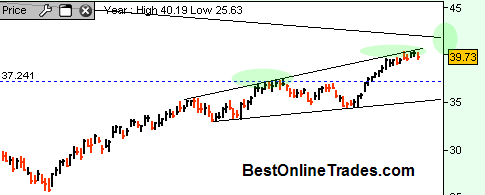
This last chart is of the QQQ’s. So we have a near term picture and you can see the QQQ’s are approaching the long term down trendline. Also price is currently hugging the top more recent trendline that I alluded to before could be a broadening wedge. But price is still not giving back much ground. Not yet anyway. The volume relationships of the past 10 days or so on the QQQ’s tells me there is potential for a more involved correction still, but at least until now it has not revealed itself.
