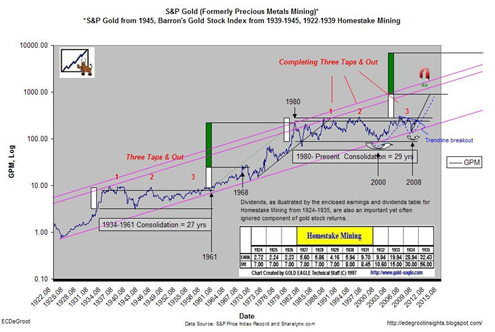
You really need to study this long term gold mining stock index chart. It was sent to me by a buddy of mine and the chart was made by one of the regular blog posters over at www.jsmineset.com .
It is a super long term gold mining stock index chart that goes all the way back to the 1920’s. What absolutely blows my mind about this chart is that it shows that the GOLD MINING STOCK sector has still not really even had a breakout from the trading range that began in 1980 !!!
This is an amazing chart!
This chart says that if the gold miners do get a northward breakout going then we could see a real feeding frenzy in the mining shares again.
But the chart also says to me:
- That inflation is on its way big time
- That broad market equities are also about to enter a new major bull market
- That the gold price will continue much higher
The second point could be correct because in general mining stocks have trader higher along with broad market stocks for a long long time. It could be at some point this relationship will cease to exist but for now this relationship holds true.
This long term chart is truly mind boggling to me. But it definitely should be remembered that it is a very long term stock chart. Should a breakout occur, the expected move based on the above chart could take YEARS to materialize fully.

