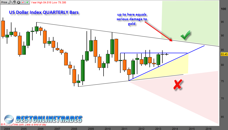
The chart you are about to view below looks a little bit like a children’s drawing. Of course it is not a children’s drawing, but instead a quarterly price candlestick chart of the US Dollar index, the ‘stock of the United States’.

Quarterly price charts are obviously slow moving, it takes 3 full months just to form one bar or candle. They are like the ‘super tankers’ of the charting world because once they start to move significantly in a certain direction, the odds are that this will be the established trend for quite some time.
Looking at the chart above we see that the US Dollar index has essentially been trendless for approximately the last 7 years !
The US Dollar Index on the long term basis has been choppy and in consolidation, and not in full trend tilt mode. One can see that since mid 2011, the US Dollar index has been in a slight uptrend (although admittedly weak). This is interesting because it is also true that the gold price has been under severe pressure since mid 2011.
If we focus in on the last 10 or so quarters of the US Dollar index we can see that it appears to be building a rough approximation of an ascending triangle. If this is true, then it could mean the US Dollar Index wants to make an attempt or attack on the top resistance boundary line as shown by the red pointed arrow above.
I suspect that if such a move were to occur then it would lead to some more serious damage to the gold price and a possible major low in the gold price. But this would depend on the nature of the attack on the top resistance boundary line. Breaking up and through the top resistance line above would be the death knell for the gold market.
However at this time I am holding out optimism that if the US Dollar Index gets up to the red pointed arrow above, it will fail up there and then resume back into the triangle formation. This will be key quarterly price action to watch !! It will be trillion dollar trade type of price action to watch in my opinion because if we see a failure up there, then it starts to open up possibilities for change of trend to down again.
The yellow shaded area in the chart above is the near term caution zone for the dollar index and would show near term weakness and bearish possibilities.
The red shaded area represents total failure of the US Dollar Index and possible serious inflation and/or renewed strength in gold.
Stay tuned to BestOnlineTrades.com for updates on this exciting long term trading dynamic in the US Dollar Index and how it could develop into the next mega position trade….
