Sp500 Sitting Right Under Resistance Channel

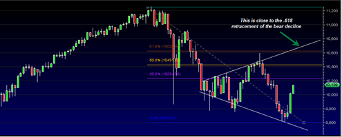
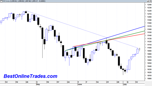
The sp500 is sitting right under the medium term resistance line that has marked the downtrend since end of April 2010. Today was pretty much a non event day in terms of price movement and the sp500 printed another doji candlestick with a modest range.  It was also an inside day in that we did … Read more

DRYS DryShips Inc Close to a Confirmed Triple Bottom

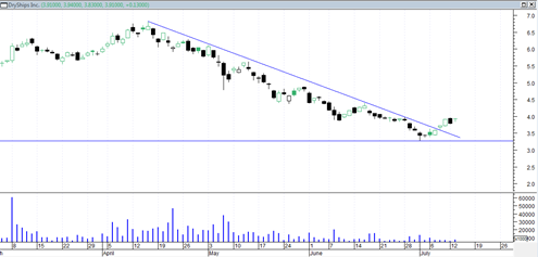
There are so many buy setups right now it is not even funny.  A very long time ago I did a post on how DryShips Inc was headed for a triple bottom.  As it turns out the triple bottom never arrived.  Instead DRYS broke through the downtrendline indicated at the link above but then just … Read more

Quick Comment on Crude Oil Price

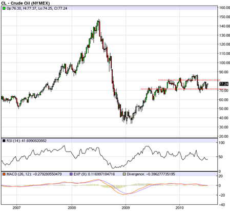
Crude oil actually looks quite constructive lately if you look at the longer term chart.  I hate to even mention the word deflation or inflation at this point, but looking at the chart of crude oil does not seem to indicate deflation anymore. The chart shows the collapse from the 145 to low 30’s price … Read more

Sp500 Trades Inside an Inverted Triangle or Broadening Wedge

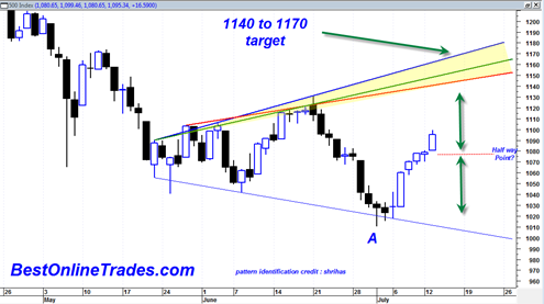
The Sp500 continues to currently trade within an inverted triangle or a broadening wedge formation.  This type of pattern has been very common in recent years and you are likely to see many more or them on many different markets.  They paint a picture of indecision and confusion and can be very difficult identify early … Read more

China Agritech Inc May be a Very Good Position Trade Going Forward

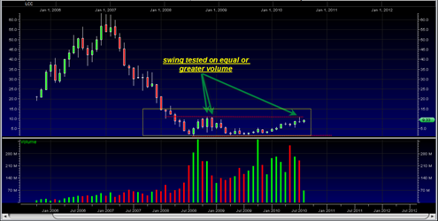
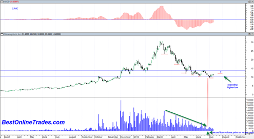
I posted before briefly on CAGC China Agritech Inc as having a good possibility of moving higher to the top of its inverted triangle pattern.  But after looking at the longer term chart and evaluating the risk reward I think I have to conclude at this point that CAGC is a good position trade from … Read more

Unemployment Rate to Start Falling into end of 2010 and early 2011

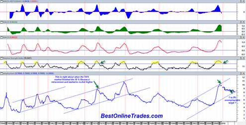
Over the weekend I created what I consider to be an absolutely fascinating chart of the unemployment rate going all the way back to February 1st, 1948.  I plotted the unemployment rate based on the monthly figures I have going back to 1948.  So the chart you will see below is essentially a monthly price chart except that the data is the monthly unemployment rate instead of stock prices.

I have never before seen the monthly unemployment rate plotted along side typical momentum indicators and oscillators.  Everyone holds their breath before the monthly unemployment report comes out and counts on it as a major market moving event.  But if it was so important then why is it not always viewed in chart form to help better identify unemployment trend, momentum (or lack thereof), and historical context ?

The unemployment rate can be tracked in terms of MACD, Relative Strength and many other indictors just like stock prices can.  There are buy signals and sell signals in the unemployment rate and the validity of them is probably more significant than most other charts because we are dealing with monthly data points indicative of longer term trends which are less likely to whipsaw.

Read more

PowerShares QQQ Trust Series 1 ETF Forming A Massive Head and Shoulders

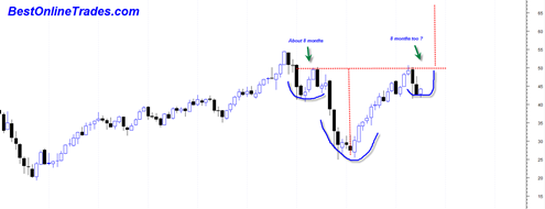
The PowerShares QQQ Trust Series 1 ETF monthly chart is quite an amazing sight to behold.  I just did a post about how the current market structure could be similar to that of the mid 1970’s time frame and could potentially evolve bullishly instead of bearishly. If you look at the long term monthly chart … Read more