Spot Gold on the Brink

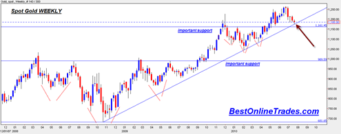
The weekly chart of the spot gold price shows that gold setting up for a very important test next week.  The test is to see whether or not the gold price can hold longer term uptrendline support on the weekly chart.

The uptrend shown in the first chart below is a 2 year uptrend line and has a good degree of significance.  If we break down through this trendline on the weekly chart next week then one has to question the current integrity of the gold bull market in my opinion.

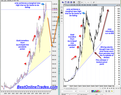
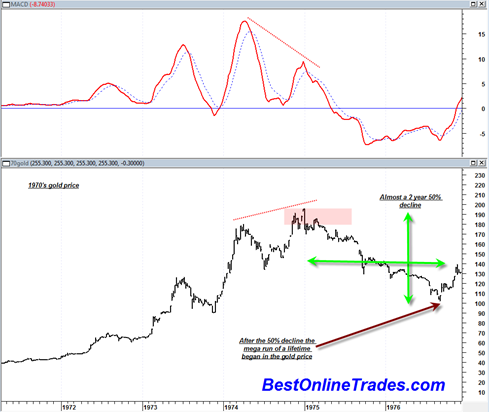
I did a couple other recent posts pointing out the weekly bearish divergence on the gold price chart and the similarity to the mid 1970s gold price topping formation.

If gold breaks down through the uptrendline next week then it would probably challenge the 1160 level which is an important level of support as it was the neckline level of the previous inverse head and shoulder bottom formation (see it drawn in on the first chart below).

If 1160 breaks then it could imply an eventual test of 990 level which once again is a very important level of support and again the neckline level of the previous massive inverse head and shoulder bottom formation.

Perhaps I am looking much too far ahead, but if we do get to 990 and then 990 also breaks it could imply a move down to 680 as a possible final bottom.  That would be roughly a 46% drop from the spot gold all time highs.

spotgold20100722

I think it is important to keep in mind that the gold price has been going up since 2001 or almost 10 years.  I am probably repeating this line of thought from a previous post, but even very strong bull market uptrends sometimes need a mid point correction as a pivot point for the eventual blow off down the road.

Read more

sp500 about to Breakout or Break Down from Diamond Formation

Trader’s worldwide need to pay attention to this important pattern developing in the major indices.

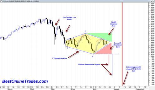
Both the sp500 and the SPDR S&P 500 ETF as well as a few other indices have as of today completed the formation of a quite large diamond chart pattern.  This is without a doubt one of the most disgusting technical analysis patterns in existence because of its ability to confuse both bears and bulls and basically keep them in a washing machine whipsawing them all over the place.

It is also extremely difficult to spot early on.  I wish I had known ahead of time that this pattern was about to form as it would have made things a bit easier.

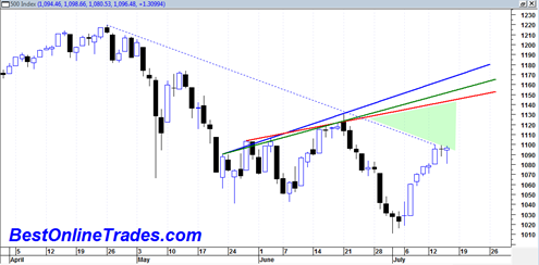
So the situation right now is that the sp500 is near the apex of this pattern and soon a result will come out of the pattern either bearish or bullish.  This diamond pattern can either be a continuation pattern or a reversal pattern.  If it is a continuation pattern then we would expect a similar somewhat straight line move down out of the pattern similar to the straight line move that lead to the construction of the pattern (the end of April to May 6th price move).  This would activate if we get into the red shaded area on the chart below.

If it is a reversal pattern then we should see a topside breakout out of the pattern into the green shaded area.

Read more

Keep the Bullish Scenario in your Back Pocket

The market action today was not the stuff of bear market action.  It was a massive bullish engulfing of a previous day indecision doji.  The daily MACD histogram sell signal which I mentioned yesterday would likely be confirmed today was not confirmed today.  In addition the WEEKLY macd histogram at least as of the second … Read more

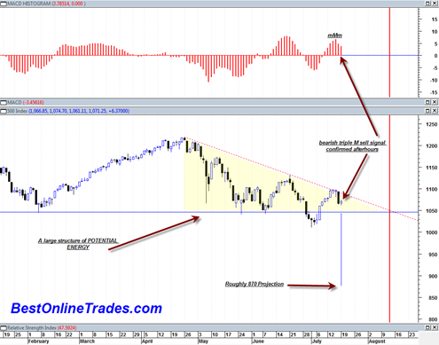
Bearish daily MACD Histogram Sell Signal Confirmed Afterhours

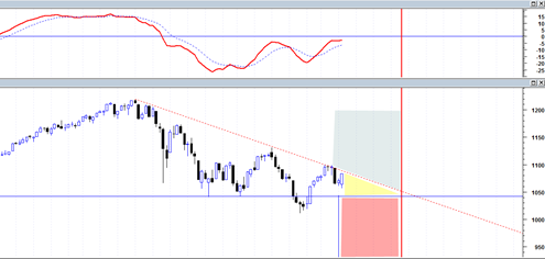
I have to say still at this point that the market character is still decidedly bearish looking.  We have been making a series of lower topping formations (in the form of tower tops) that are meeting an ever present horizontal demand line.  I have no clue who the buyer is at the horizontal demand line, but it looks like they are about to be overtaken quite soon.

The current structure of the entire market as represented by the sp500 since end of April has now shown a very clear descending triangle.  Perhaps this is one of the most under rated patterns out there in the technical analysis field.  I rarely see much discussion of it.  But that is actually a good thing. I would rather not have the whole world discussing it as it would then probably fail.  The mainstream financial media both online and offline seem to mostly recognize the head and shoulders patterns.  Perhaps that is why they are failing more often now than in the past.  At least it seems that way.

sp50020100719

But anyway, this descending triangle has a rough measurement towards the 870 level.  A lot of energy has been built up in this structure and it should lead to a big one day move.  But as is typically the case, there are likely to be a lot of big individual swings that mark the entire decline.  This market has had a pattern of making very large swing trading ranges and I don’t see any reason why it should stop now even if we do get a big one day move down.

Read more

August 12th Slated to be In the News

According to Larry Pesavento the August 12, 2010 date is going to be ‘in the news’ because it contains the now much talked about cardinal climax aspects that are supposed to be extremely negative. You can listen to his comments yourself right here (click arrow). Source: http://commoditywatch.podbean.com/ Note that he makes the comment that the … Read more

A Doji Then a Hanging Man Candlestick

Yesterday the sp500 printed a doji candlestick with a narrow range.  Today’s reversal looks like a hanging man candlestick which is also potentially a reversal in trend type candlestick. However both of these potential reversal candlesticks are still as of yet unconfirmed because we did not close below the low of either of them yet.  … Read more