Sometimes you have to stare at your price charts a little bit longer to understand the real potential magnitude of what you are dealing with. Sometimes hidden clues in the charts only make themselves known until extensive contemplation and study.
BestOnlineTrades continues to push the limits of proper interpretation of these markets and we continue to focus on interpreting price action across multiple time frames. Only those who are able to interpret the price action properly across multiple time frames stand the best chance at understanding future market direction.
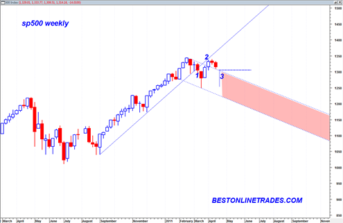
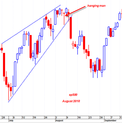
I was recently reviewing the monthly candlestick chart on the sp500 and it seems pretty clear to me now that the March 2011 monthly price candlestick is ‘potentially’ the most bearish monthly hanging man candlestick we have seen since in 41 years on the sp500. My chart data on the sp500 only goes back 41 years, so there could be a monthly hanging man that looks just as bearish as the March 2011 candle, but at least going back to 1970 I have not seen any with as much bearish potential as this one. In other words I have not seen in 41 years a monthly hanging man with such a LONG bottoming tail and a clean body with almost no top candle wick on it.
This monthly March 2011 hanging man candlestick is potentially very bearish because it has all of the perfect elements that make for a potent hanging man candle.