Operation Scorched Earth

This last week of upside trading was a total blow out to the upside.  It was almost as if ‘they’ had a plan of operation… like a scorched earth type of plan, not giving the other side a chance to get out.

There is a candlestick pattern known as ‘three white soldiers’ which is essentially a bullish signal because you have 3 successive long white bullish candlesticks in a row and it tends to be a sign that a new crowd is taking hold of the tape.  But looking at the tape I see not 3 but 5 of them.  So I can only assume it is giving the same signal.

Now comes the question whether July 5th will be a down day or not since 5 up days in a row is rare enough as it is.

I would say that odds suggest that it will be a down day (or at least some type of consolidation hammer day) because today we hit and stopped right at the previous ‘shoulder’ of the 2/18/2011 high.  It looks like a natural resistance point.

Read more

sp500 Finished Quarterly Candlestick as Consolidation Hammer

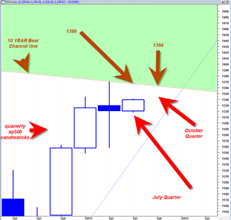
The sp500 managed in the final days of the quarter to change more negative looking quarterly candlestick into a more neutral looking candlestick.

The quarterly candlestick now looks like a simply morphed doji or tendency towards a reversal hammer.  Whatever you want to call it, I have seen these types of candles form right under important resistance zones as consolidation candlesticks that lead to upside breakouts.

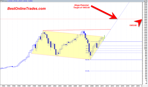
The resistance zone in the chart below is the 10 year sideways bear channel.  I break above this channel would be a bullish longer term sign and should lead to the sp500 moving to about 1600 and then with an outside chance of moving to a target of 1905.68.

The 1600 potential target is the top resistance band of a very large broadening wedge resistance line.

The 1905.68 longer term target, perhaps by end 2013 is calculated as an A B C upward projection based on the .382 % retracement that occurred in May 2010 time frame which was a bullish retracement in the sense that it was the bare minimum and showed a market with extra strength.

Read more

Quarterly Long Term sp500 Chart Summarizes the Bull or Bear Case

The bull case and bear case is never really totally clear unless you branch out to the much longer time frames.

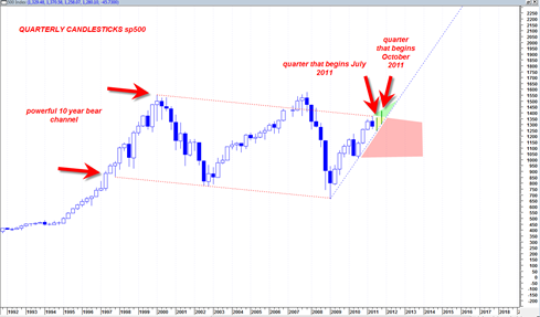
Based on the quarterly sp500 chart I can only make the conclusion that the market is still in a potential zone for more bearishness and also in a potential zone for more bullishness.  You will understand what I mean when you look at the chart below.

The fact is that the sp500 has been trading in a 10+ year long trading channel sideways in nature with a slight downward slope.  There are two more quarters for trading in 2011 and if you look at the chart below you will see that as long as the two trading quarters are still supported by the dotted blue up trend line, then the market is on track for a massive 10 year channel break out.

sp50020110627c

Read more

Monthly sp500 Price Chart Shows that July is Key Determinant Month

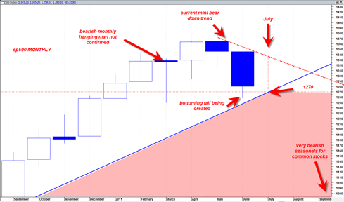
The low in the sp500 for June so far was 1258.  Today we had a nice sized rally.  With just 3 trading days left in the month of June the market now has the option to create a larger June monthly bottoming tail which shows demand, or continue down the last 3 trading days of June and perhaps even more so into the start of July.

Presently it is looking like the market wants to create more of a bottoming tail for June that could see the market rally into early July.

In the chart below this would create a June monthly candlestick with a longer demand tail and then create greater probability that we could see a rally as high as 1330 which is the top boundary of the current ‘mini bear’.

Assuming that actually does happen, then we could see 1330 hold as bear market resistance leading to a flat to slightly down August 2011 and then maybe a much more meaningful drop in the typically very bearish seasonally September.

Read more

Is the Market Building Steam to Bust Down or Up

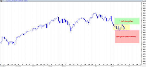
What is the verdict?  The sp500 has for the last couple of weeks been trading in a rectangle formation with bit moves to the upside and big moves to the downside.  Add up one big up move minus one big down move and the net result is zero progress. Or is it?

Well it is progress towards an eventual outcome that will either be bearish or bullish.

The Bullish Case

The bullish interpretation is that the current trading rectangle formation is a pausing point of the recent mini bear and then a reversal point where prices consolidate and then bust out north from the rectangle.

The bullish interpretation is currently supported by the fact that the recent mini foundation of price work is on a lower relative volume than occurred on the SPY in mid March 2011.  That would seem to support the case that the current rectangle is serving as a pause point and reversal point.

Read more

Bullish Hammer Failed Yesterday BOT Short Signal Still Intact

This is really a weak tape again today.. the bullish hammer of yesterday was a fluke and no follow through today.  The tape looks weak to me and 1250 now looks like it will be busted eventually possibly into July 2011.

This is bearish for the overall market for the longer term.  Unless by some miracle the market can stage an end of day rally to close flat today, this is setting up for much more down in the weeks ahead.

I continue to remain on the BOT Short signal for the sp500 despite my cheerleading yesterday about the big hammer reversal.  Remember, regardless of what I express in these postings, if I am on a BOT Short signal, then that is my preferred bias and committed signal REGARDLESS of what I am venting about in my postings in between.

The US Dollar continues to show strength and may catch a longer term bid.  The administrations actions yesterday to try to pump the market with the crude oil release may now be seen as a total act of desperation as they see signs the economy wants to contract again..

Read more