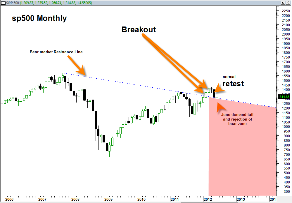
Here is a quick recap on some of the reasons why I see USA stock indices trading much higher, probably up to new 52 week highs. Some of the reasons are more heavily weighted than others, but they are all important.
- Everyone hates the Euro and even the mainstream media has caught onto the ‘end of the Euro’. Problem is the commercials traders don’t seem to agree with this view and they are usually right. In addition BestOnlineTrades.com identified a important buy zone in late May 2012 from a large Gartley Buy Pattern in the FXE Euro. The patterns are never guarantees, just probabilities, but this one looks highly probable to me.
- There is also a bearish pattern in the UUP US Dollar. So that typically means the stock market goes high as dollar weakens. This is starting to look more and more likely as we head into the election.
- There was a bullish Fib pattern in the Dow Transports recently.
- There were recent bullish Fib buy patterns in the GDX and the USO which supports the bear pattern in the Dollar Index. Also there was a Fib Buy pattern in Gold.
- NYSE Summation Index as well as other breadth indicators are currently in a bullish stance for the first time in about 2 months.
- We are on the YEARLY sp500 chart right now in a huge topside breakup zone above and through the long term 2007 resistance bear line.
- The downside volume in the SPY in May was weak at best and was not indicative of the start of a major new bear market.
- We got a confirmed weekly MACD histogram buy signal today on many US market ETFs !!!
- There is a AB CD projection leg into end of year that projects for sp500 to 1600. This is a bit far out projection and way to early to be getting excited about, but it is worth more research assuming we break to new 52 week highs in the indices (I believe we will).

The above chart of the long term sp500 along with bear market resistance line is a beauty and a very important one too.
There are a few important points to note about the chart above.
First, it is a monthly chart so it is long term. Second note that the blue dotted line is essentially the equivalent of the long term bear market line. Staying UNDER this line provides opportunities and potential for more heavy long term bear market action. Staying ABOVE this line shows a breakout and removal of the long term bearish trend.
Note in the chart above the monthly price candlesticks that show how the sp500 did a northward topside breakout on a sign of price strength.
Then note the retest which is quote normal market action. This retest was also seen on the QQQ in a more clear fashion.
And lastly, note the KEY JUNE 2012 price candlestick action which currently shows in mid June 2012 that we have a REJECTION of the red shaded bear area and a holding above the blue dotted line. This tells me we have done a successful retest and can now resume higher again.
My only caveat with the above mentioned conclusion is that the month of June 2012 is not finished yet. The monthly June 2012 price candle could still suffer a huge sell off in the second half of June and cause the above chart to look much more bearish. However at this time that is not my take. My take is that we have done a successful retest and will now resume higher to new 52 week highs.
