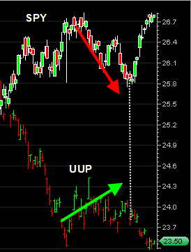
This chart to the left is a side by side chart of the SPY ETF and the UUP ETF. The UUP ETF represents the US Dollar Index.
I put this chart up because you can see the clear correlation between the recent bounce we had in the US Dollar Index and the correction we had in the broad market.
But since the US Dollar has started it’s decline again (vertical dotted line) we have seen the broad market power higher with a lot of strength.
I mentioned in a previous post about the precarious situation the US dollar is in right now and could have dramatic implications for several different markets.
If you look at the chart to the left one could make the case that the UUP has made a small double bottom and could get a spike up bounce from those levels. I don’t know if that will happen, but if it does then we could see the broad market pull back sharply for a short term period before resuming higher. But the overall message in this chart is that the weaker the US Dollar gets, the stronger the broad market gets.
