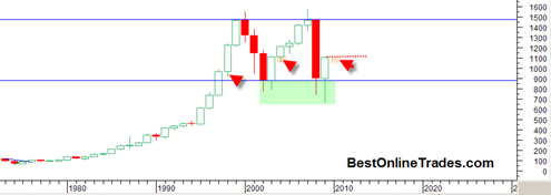
This is a very interesting candlestick chart of the SP500. It is the YEARLY price candlestick long term chart. There are few interesting things we can see from this chart. The most obvious is the very clear long term trading range almost 10 years long. Despite all the bears endless preaching the fact is that so far at least the market has not been able to break DOWN out of this trading range and therefore keeps the cause building consolidation case intact. The longer the market trades within this large trading range without breaking down under 900, the better argument can be made that eventually it will break topside.
The other thing to note is the current 2009 yearly candlestick. This massive yearly candlestick has a large bottoming tail which indicates the strong demand that came in and held prices within the trading range.
A key observation can be made about the new 2010 yearly candle which obviously will start to be created in January 2010. And that is that usually one expects some free play into the previous years candle as you can see from the first two red arrows on the chart above. It does not have to create free play into the 2009 candle but it is usually expected. If it does not create any free play into the 2009 candle then we could be dealing with an even stronger market than anticipated as then the open for the year would be the same as the price low and create quite a bullish scenario for 2010.
So this analysis supports the probability that the real correction will get going in early 2010 to create the bottom wick portion of the 2010 yearly candle. How deep that retracement is remains to be seen. It may only be a 5% to 15% retracement into the 2009 candle, but that could still be well worth trading. I am just really skeptical that the market is going to get this retracement going at any time before December 31, 2009.

