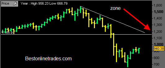
I am starting to become OBSESSED with this monthly chart of the SP500 (Gee I need a doctor!). Ok I am just kidding, but still this monthly SP500 chart is very important for several reasons.
For starters, it defines in one clear view the entire bear market we have been in since 2007 and it shows with good clarity (the white down trendline) the defining line of this bear market and the hurdle that needs to be overcome to change the long term outlook.
After staring at this chart for a while I can tell you that my sense is that the white down trendline really looks like a magnet to me. I really think we have a good shot at between 1100 to 1200 on the SP500. As far as timing… hmm well maybe by early next year? Maybe a little bit sooner.
So far the MONTHLY price bar for July is looking pretty good. Now if we can end the July Monthly price bar so that it looks similar to what is shown in the chart above then I think we could be looking at quite a running market into the end of this year.
Volume is still the wild card though. We are just not seeing blockbuster volume and it is a concern as far as a sustainable rally goes. Of course the low volume is to be expected in the slow summer months and this time of year. So my thinking is still that the really juice of the rally will not really kick in until September.
