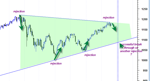
Here is another way of looking at the sp500 chart in combination with the 2009 long term up trendline and the lines that connect the recent action in April 2010 and October 2010.
It appears to take the shape of a very large symmetrical triangle that has seen many rejections on different portions of the triangle. The important thing to remember about this pattern is the size and time duration which means that market is compression into a very big move that should have some staying power. Notable is the levels where rejection was seen.
At some point the sp500 will stop rejecting the boundary lines and break through one of them decisively.
I would be a fool to guess which side it will break through. But I will do so anyway. For now my guess is we break through down and I am basing this call on the average volume analysis of each of the legs and the recent very high volume break downs we have seen in financials and GE.

