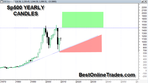
This is a very very important long term stock price chart. It is a yearly candle bar price chart of the SP500 from the early 1970’s to the present. Each candle bar represents one full year.
If you showed this price chart to me without telling me it was a stock market index like the sp500 and then asked me what my opinion of the chart is. I would tell you that in my opinion the stock or index has shown a nice steady uptrend for a reasonable period of time along an uptrendline and then sky rocketed above trend in somewhat parabolic fashion. Thereafter it has started a corrective process, once again returning to and testing the average uptrendline (this occurred in 2009).
But I would still have to conclude that the stock is still in a long term uptrend. Yes it is in a sideways corrective process, but that is definitely not unusual.
Having said that it makes one ponder the current dynamic of the SP500. Even though we have had a housing crash, seemingly endless bank failures and government indebtedness, just a simple glance at the above price chart tells me that the current trend would best be described as being in a ‘caution zone’, but not in the ‘red zone’.
If quarterly or yearly SP500 price is able to eventually get into the red shaded zone as shown in the chart, then that would depict a very serious bear market situation. On the contrary, if by some chance price were able to break above the 1500 level and get into the green zone and sustain itself, then it would imply a very bullish breakout level. Everything that lies in between is simply cause building and base building.
So to make a long story short, the conclusion I make for now is that I am still open minded. I am open to higher prices going forward sometime in 2010 but at the same time aware of potential corrective risks.
The recent counter trend rally we have seen in the past 2 weeks has been on very light volume relative to a very heavy selling leg during early February. That should keep us in a corrective process for a while longer perhaps defined by a complex swing trading range as I had mentioned a few times in previous posts. A new corrective ‘C’ leg down now will be interesting to watch to see if it can make some sort of double bottom at the 1050 level or finally get a lower low relative to the 11/2/2009 swing lows.

