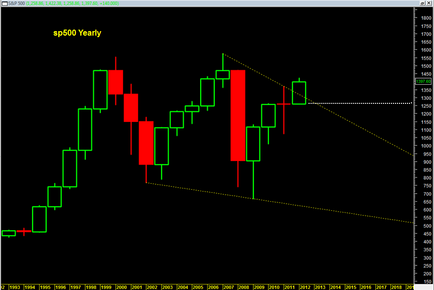
The yearly chart of the sp500 was looking bullish for a long time and in fact during 2012 continued to look bullish for the simple fact that it was able to break up north through and above the 2007 bear market down trend line.
As with any price chart, there is always the conditional event of the time frame actually concluding. Before we can conclude anything with reasonable certaintly on daily, weekly, monthly of quarterly, we need to see the time frame conclude and finish the price bar.
This also holds true for the YEARLY price candlesticks. The current yearly 2012 price candlestick looks quite bullish actually. But we are not even at the mid year point yet.
In my previous post on a possible NYSE stock market top I talked about how the market may be forming bearish tendencies into end of year based on some large patterns and seasonality.
So if we are to conclude that the second half of 2012 is going to be a heavy bearish bias, then this large 2012 candlestick will likely start to look a lot different. Namely it would then possibly transform into a yearly shooting star candlestick, or a bearish gravestone doji candlestick. The most bearish situation would be a closing near the 1250 range as it would put a close for the year back inside this large bearish channel or falling wedge of sorts.
A yearly bearish shooting star candle for 2012 would bode potentially extremely bearish for 2013 and could set up 2013 as similar looking to 2008 !!

