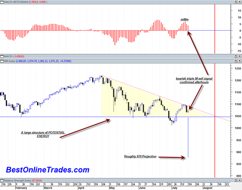
Bearish daily MACD Histogram Sell Signal Confirmed Afterhours

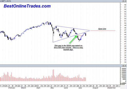
I have to say still at this point that the market character is still decidedly bearish looking.  We have been making a series of lower topping formations (in the form of tower tops) that are meeting an ever present horizontal demand line.  I have no clue who the buyer is at the horizontal demand line, but it looks like they are about to be overtaken quite soon.

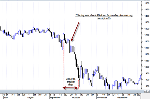
The current structure of the entire market as represented by the sp500 since end of April has now shown a very clear descending triangle.  Perhaps this is one of the most under rated patterns out there in the technical analysis field.  I rarely see much discussion of it.  But that is actually a good thing. I would rather not have the whole world discussing it as it would then probably fail.  The mainstream financial media both online and offline seem to mostly recognize the head and shoulders patterns.  Perhaps that is why they are failing more often now than in the past.  At least it seems that way.

sp50020100719

But anyway, this descending triangle has a rough measurement towards the 870 level.  A lot of energy has been built up in this structure and it should lead to a big one day move.  But as is typically the case, there are likely to be a lot of big individual swings that mark the entire decline.  This market has had a pattern of making very large swing trading ranges and I don’t see any reason why it should stop now even if we do get a big one day move down.

Read more

A Doji Then a Hanging Man Candlestick

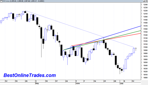
Yesterday the sp500 printed a doji candlestick with a narrow range.  Today’s reversal looks like a hanging man candlestick which is also potentially a reversal in trend type candlestick. However both of these potential reversal candlesticks are still as of yet unconfirmed because we did not close below the low of either of them yet.  … Read more

Sp500 Sitting Right Under Resistance Channel

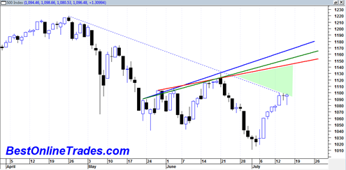
The sp500 is sitting right under the medium term resistance line that has marked the downtrend since end of April 2010. Today was pretty much a non event day in terms of price movement and the sp500 printed another doji candlestick with a modest range.  It was also an inside day in that we did … Read more

DRYS DryShips Inc Close to a Confirmed Triple Bottom

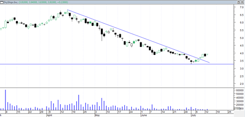
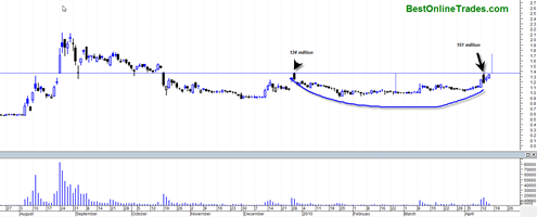
There are so many buy setups right now it is not even funny.  A very long time ago I did a post on how DryShips Inc was headed for a triple bottom.  As it turns out the triple bottom never arrived.  Instead DRYS broke through the downtrendline indicated at the link above but then just … Read more

Unemployment Rate to Start Falling into end of 2010 and early 2011

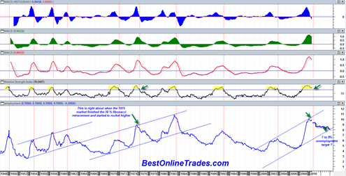
Over the weekend I created what I consider to be an absolutely fascinating chart of the unemployment rate going all the way back to February 1st, 1948.  I plotted the unemployment rate based on the monthly figures I have going back to 1948.  So the chart you will see below is essentially a monthly price chart except that the data is the monthly unemployment rate instead of stock prices.

I have never before seen the monthly unemployment rate plotted along side typical momentum indicators and oscillators.  Everyone holds their breath before the monthly unemployment report comes out and counts on it as a major market moving event.  But if it was so important then why is it not always viewed in chart form to help better identify unemployment trend, momentum (or lack thereof), and historical context ?

The unemployment rate can be tracked in terms of MACD, Relative Strength and many other indictors just like stock prices can.  There are buy signals and sell signals in the unemployment rate and the validity of them is probably more significant than most other charts because we are dealing with monthly data points indicative of longer term trends which are less likely to whipsaw.

Read more

I just went long the United States Oil Fund LP ETF USO

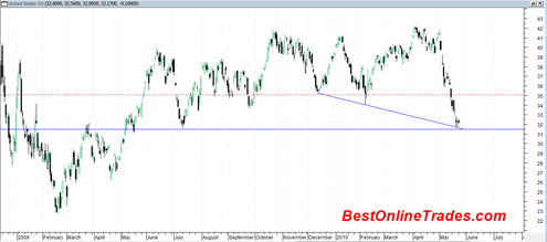
Going long the United States Oil Fund LP (ETF) USO or the ProShares Trust ProShares Ultra DJ-UBS Crude Oil UCO ETF may be one of the most attractive trades I have seen in a long time.  It looks like it is an outstanding contrary type trade. I already mentioned that I am expecting a bounce … Read more

Hanmi Financial Corp may do a continuation breakout soon

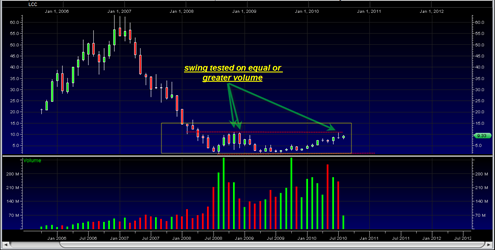
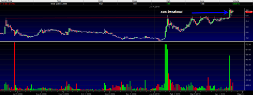
HAFC has recently broken out north out of a quite large ascending triangle formation and has done so with a wide price spread and heavy volume, confirming it.  The volume was slightly less than the highest volume swing in the previous range and so that is somewhat of a concern.  However at least for now … Read more

Fannie Mae Level 2 and Chart Structure looks Good

Everything is flying up lately including the ever so hated Fannie Mae and Freddie mac.  These two stocks are laggards however they do seem to be catching a good spark and overall the chart structures of both seem supportive of a big breakout within the next two weeks or so.

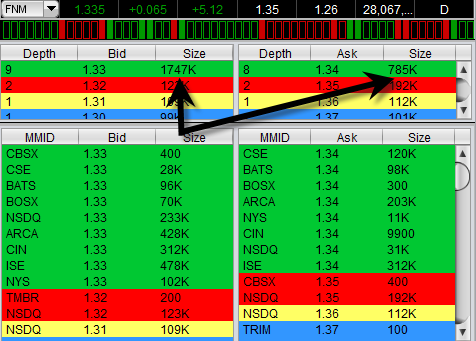
I have been watching level 2 on both of these stocks and I have consistently seen very strong bid support relative to ask volume.  In fact on some occasions the bid support has been stronger than ask volume by a factor of 10 to 1.  So it is telling me that there is some heavy accumulation going on the last several days and ‘they’ appear to want to take both of these higher. 

This should not come as surprise however because most other financials stocks are zooming higher as well such as AIG and BAC and C as well.  Both FNM and FRE are late to the party so to speak but it could be that they are doing a pre earnings run up which I have not been able to confirm as May 6th, 2010.  Yahoo Finance says May 10th, 2010.

fnmlevel2

Level 2 has been useful to me to see the demand and supply situation of a stock.  Usually it is just useful for entries and exits but sometimes you can see a pattern emerge over time as seems to be the case with both FNM and FRE.

Read more