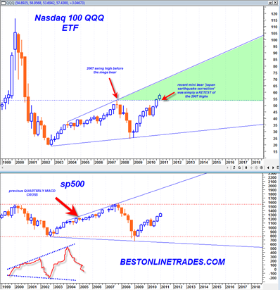
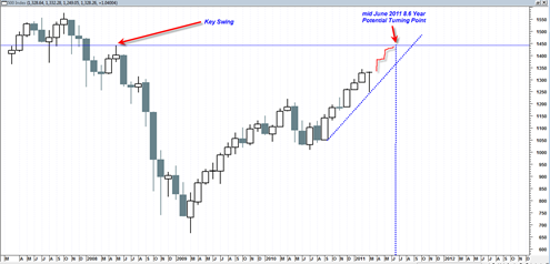
One of the longest most slowly moving price charts is the quarterly price chart. It is always a good idea to review this chart after every quarter or two to be sure one is correct on the markets longer term intentions.
The quarterly chart is akin to a large oil tanker. Once it has started cruising in a given direction it is very unlikely going to change that direction unless acted upon by a very significant force. The current ‘action’ that appears to be driving the market is the easy monetary policy and this does not seem ready to dramatically change any time soon.
The current factual state of the markets are that we have a bullish quarterly MACD Crossover. This crossover is in an early state of crossover which basically means that the bullish trend implied by this crossover is just beginning. In addition the quarterly MACD signal line is just now in the process of crossing above the zero line, another longer term bullish sign.
The last time the quarterly MACD had a bullish crossover was in late 2004. That led to generally rising prices for almost 3 full years in the sp500. It could very well be that the most recent quarterly bullish crossover will also lead to rising stock market prices for 1 to 3 years or maybe more. The current ‘news’ does not seem to support this idea, but relying on news for market direction was never a good idea anyway.

