Of all things technical analysis, I also enjoy pondering the longer term charts. They cannot really be traded on, but they kind of give you this ‘I am the captain of this ship’ type feeling. The other nice thing about them is they help to filter out all the shorter term ‘trading noise’ that exists in the shorter time frames.
I don’t look at the super long time frames that often but I usually do when the calendar changes to a new week, month, quarter or year.
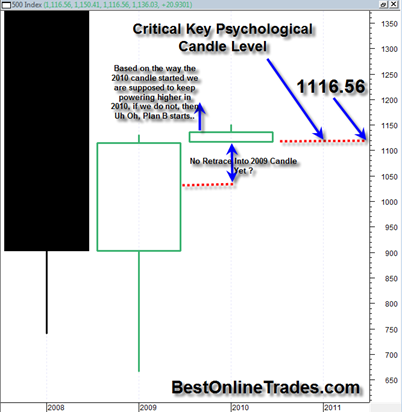
The fact I am talking about on the SP500 in the title of this article is that the current YEARLY OPENING PRICE is exactly equal to the current YEARLY LOW price. I had mentioned this one other time before but it is worth mentioning again because in terms of candlestick analysis it is very important.
I am embarrassed to admit that only until recently have I started using candlestick charts exclusively. I was using regular bar charts for the longest time and never really shook the habit. Perhaps I was just stubborn. But I can tell you with zero doubt that understanding the basics of candlestick analysis, patterns and psychology behind the candles and their structures and patterns will give you a very significant trading advantage over the longer term.
The best book on Japanese Candlesticks (of which I have a copy) is Japanese Candlestick Charting Techniques by Steve Nison. It is really well written and provides a huge amount of charting examples to clearly see candlesticks in action and their expected outcomes.
So back to my point about the opening price of the current year 2010 being exactly equal to the low price for 2010. The actual value for the low and opening is 1116.56 according to my price data (I am assuming that my price data is all correct here otherwise some of the conclusions I make here slightly less meaningful).
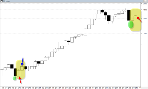
According to my data there was only one other year in the SP500 where the yearly open was exactly equal to the yearly low since 1969. There are pointed out in the chart below with the two red arrows.
Read more

