Elliottwaver Makes Similar 2007 2011 Comparison

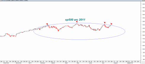
This Elliottwave site makes a comparison between the 2007 and 2011 time frame to argue possibly that we are at a similar juncture for a break down as was the case in 2007.

Recently I have also done a 2007 2011 comparison with respect to the head and shoulders bottoming formations that were occurring near market highs.  The comparison is compelling and the elliottwave argument is also compelling.

Having said that I have to admit that the recent talk by politicians and TV network pundits on how the stock market will crash this Monday if there is no debt deal is quite concerning from a contrarian standpoint.  Suddenly the politicians and the TV talking heads are expert stock traders and can predict a market collapse this Monday?

Something does not click here.  From a contrarian standpoint I have to say that all this ‘market will dive’ talk unless there is a huge deal by end of this weekend is concerning.

Read more

sp500 Finished Quarterly Candlestick as Consolidation Hammer

The sp500 managed in the final days of the quarter to change more negative looking quarterly candlestick into a more neutral looking candlestick.

The quarterly candlestick now looks like a simply morphed doji or tendency towards a reversal hammer.  Whatever you want to call it, I have seen these types of candles form right under important resistance zones as consolidation candlesticks that lead to upside breakouts.

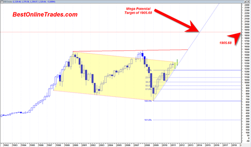
The resistance zone in the chart below is the 10 year sideways bear channel.  I break above this channel would be a bullish longer term sign and should lead to the sp500 moving to about 1600 and then with an outside chance of moving to a target of 1905.68.

The 1600 potential target is the top resistance band of a very large broadening wedge resistance line.

The 1905.68 longer term target, perhaps by end 2013 is calculated as an A B C upward projection based on the .382 % retracement that occurred in May 2010 time frame which was a bullish retracement in the sense that it was the bare minimum and showed a market with extra strength.

Read more

Quarterly Long Term sp500 Chart Summarizes the Bull or Bear Case

The bull case and bear case is never really totally clear unless you branch out to the much longer time frames.

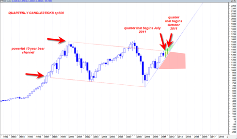
Based on the quarterly sp500 chart I can only make the conclusion that the market is still in a potential zone for more bearishness and also in a potential zone for more bullishness.  You will understand what I mean when you look at the chart below.

The fact is that the sp500 has been trading in a 10+ year long trading channel sideways in nature with a slight downward slope.  There are two more quarters for trading in 2011 and if you look at the chart below you will see that as long as the two trading quarters are still supported by the dotted blue up trend line, then the market is on track for a massive 10 year channel break out.

sp50020110627c

Read more

Important Long Term Ultra Bearish Scenario for sp500

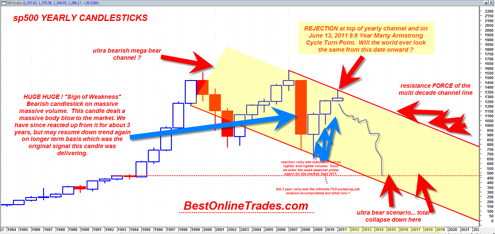
The chart you are about to see below may be one of the most important sp500 charts I have ever created with possible dramatic implications for the next 5 to 10 years.  This long term chart is much different than the other longer term multi year charts because this one shows a down trending channel.  My previous multi year chart shows a massive horizontal channel which is still valid.  But the horizontal multi year channel implies a simple trading range instead of a mega bear channel.

The very long term chart of the sp500 on the yearly basis shows that there exists the possibility that we are not hitting the top portion of a mega yearly channel right on the Marty Armstrong Cycle turn date and that this turn could mark the beginning of a multi year down move back to the bottom of the channel.

If true then it would put the sp500 eventually near 450 by 2016?  That is an extremely rough guess.

Read more

The Most Bearish Monthly Hanging Man Candlestick in 41 Years on sp500

Sometimes you have to stare at your price charts a little bit longer to understand the real potential magnitude of what you are dealing with.  Sometimes hidden clues in the charts only make themselves known until extensive contemplation and study.

BestOnlineTrades continues to push the limits of proper interpretation of these markets and we continue to focus on interpreting price action across multiple time frames.  Only those who are able to interpret the price action properly across multiple time frames stand the best chance at understanding future market direction.

I was recently reviewing the monthly candlestick chart on the sp500 and it seems pretty clear to me now that the March 2011 monthly price candlestick is ‘potentially’ the most bearish monthly hanging man candlestick we have seen since in 41 years on the sp500.  My chart data on the sp500 only goes back 41 years, so there could be a monthly hanging man that looks just as bearish as the March 2011 candle, but at least going back to 1970 I have not seen any with as much bearish potential as this one.  In other words I have not seen in 41 years a monthly hanging man with such a LONG bottoming tail and a clean body with almost no top candle wick on it.

This monthly March 2011 hanging man candlestick is potentially very bearish because it has all of the perfect elements that make for a potent hanging man candle.

Read more

Yearly Sp500 Guide Posts

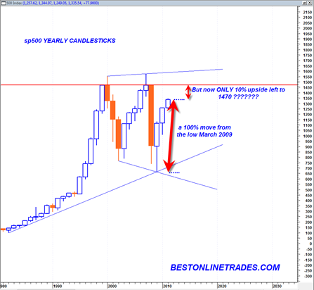
The yearly candlestick chart of the sp500 is indeed one of the most powerful technical analysis charts in the current multi decade time frame.  The yearly time frame is the maximum time frame in technical analysis and identifies massive bull or bear markets and massive support and resistance levels.

What we can see from the current yearly sp500 candlestick chart is that the sp500 has been trading in a massive trading range since the year 2000.  Before the year 2000 was a raging bull market in equities, a slow and normal trending market.  That was the mega bull future generations will look at in total awe.

But since 2000 the market has been in a highly volatile trading range state.  We see now that the sp500 has been trading the last 3 years (including this year) in an upward recovery trajectory.

For longer term purposes I think it is very prudent to look at the context of the sp500 now within this large trading range.  The fact is that since the March 2009 low of 666 in the sp500 the sp500 has traded higher until today on the order of 100%.  That is a huge move.

The percentage move from the LOW of 2009 to the HIGH of 2009 was about 70%.  The percentage move from the LOW of 2010 to the HIGH of 2010 was about 25%.

Currently the LOW of 2011 is 1249.  A move to 1470 would be about 17.5%.  But a move from the current level of today to 1470 is only about 10%.

Read more

Nasdaq Composite on a Date with Destiny

This may be one of the most important posts and charts I have posted in a long time. Market index analysis has a habit ( at least to me) of being MOST of the time fuzzy around the edges.  But occasionally it starts to crystallize into a clearer picture and better form that helps build confidence on a certain forecast.  It is a matter of making speculative forecasts, trying to identify key levels and then attempting to see whether the tape action starts to confirm your own forecast.  If it does not then one must change tack and work with alterative scenarios.  It is always good to have a small handful of scenarios to work with, both bullish and bearish otherwise it may leave you in a vulnerable position.

The current market is akin to a 200 car train that has no braking ability.  It is sheer price force and momentum and this is to be respected and acknowledged before anything else.  Having said that, it is also well known that no market can continue to go vertical forever.  There must be a pause so that the market can form a pivot point for a new base that can eventually push the market higher.  Markets build cause and then use it up.  When they are done using it up, they need to build new cause.  Of course after being in a market that seeming only goes up, it is always EASY to forget about any necessary looming correction.

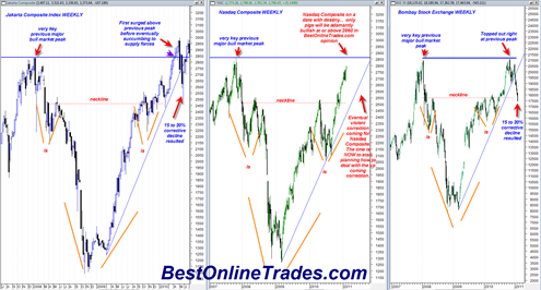
I have been picking on the nasdaq composite a lot lately and for good reason.  The nasdaq composite index is approaching a key level that represents the start of one of the greatest bear markets of all time.  This level was of course the late October 2007 peak in the market that preceded a long duration persistent trend bear market.

The key with the Nasdaq is the issue of how this 2007 peak will be dealt with?

  • Will it simply be exceeded and ignored ?
  • Will it turn on the exact tick of the previous 2007 high at 2861.51 ?
  • Or will it AT FIRST be exceeded and then eventually succumb to supply forces at a later time?

Unfortunately we will not know the exact answer until it actually happens, but we can come up with some scenarios and attempt to get a better feel for the market as we approach this previous all time high level.

Read more

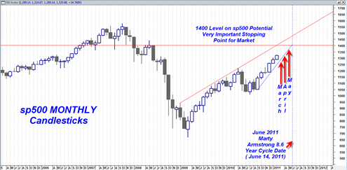
sp500 Monthly Chart Still Shows that 1400 or mid June 2011 is End Game

The more I look at the monthly sp500 chart the more I am thinking this market is going to stall out near 1400 or June 14th, 2011 whichever comes first.  Given the current degree to which the market is overbought it seems like a reasonable forecast. 1400 on the sp500 represents multiple resistance zones which … Read more

A Mega 10 to 15 year Bull Market in Commodities

I was contemplating a little bit the MACD of the monthly inflation rate chart I posted a few days ago this past weekend and it occurred to me after reflecting on the yearly portion of that chart that we have not really even begun the commodity bull market.  If you look carefully at the yearly … Read more