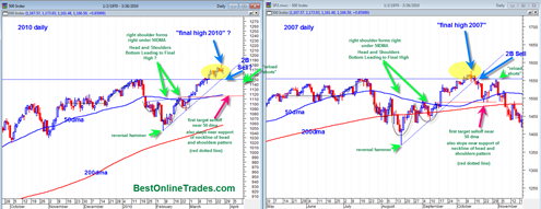
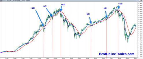
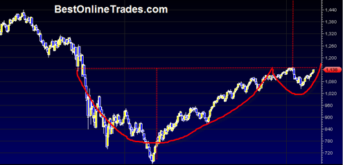
There app ears to be a pretty solid chart pattern similarity between the 2007 sp500 market top and the current 2010 market structure. The 2007 top was a slow grinding top and almost seemed like it happened in slow motion.
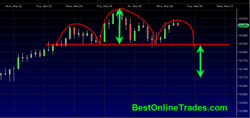
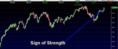
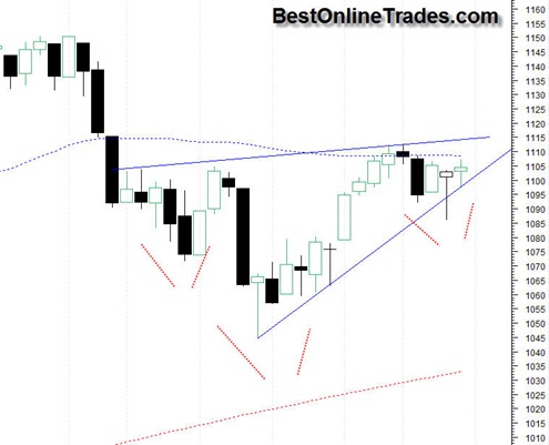
The current 2010 price action seems to have the same flavor with slow trickle up price action on generally weak volumes. It is this slow and meandering price action that seems to lull a lot of people into complacency and forget that this market still has the potential to turn on a dime and transition into fast and furious downward price action.
But actually it would be incorrect to call the price action after the final high in 2007 as ‘fast and furious’. It was still labored price action that marked the early stages of a much longer term decline.

