In the markets, the long term trumps everything else. The longest term time frames hold precedence over all other time frames. They move slower than a snails pace and are very slow to change direction once a direction is chosen.
The extended market decline from 2007 to 2009 has caused many market timers to repeatedly anticipate the next big extended bear market down leg since the lows of 2009. Since 2009 the market has delivered several periods of very high volatility and has appeased the bears to a certain degree. But it has most certainly failed to fully please the bears who were looking for another very extended period of weak tape action similar to 2007 to 2009.
Now we see that the markets are pressing up against the yearly highs of 2011 and possibly poised for an upside breakout to continue this bullish nature of the market.
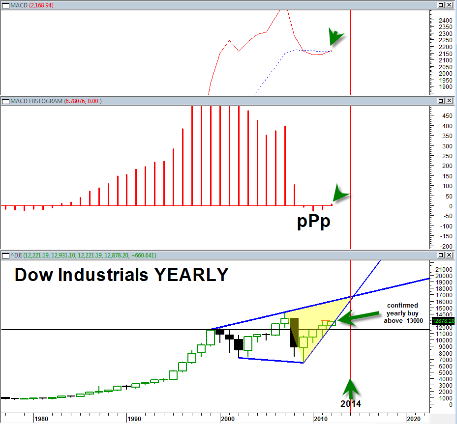
The yearly chart of the Dow Jones Industrial Average below gives us a few important insights:
- First, it says that the DJIA is currently in its 4th yearly advance. Note that the 2003 to 2007 period was essentially a 5 year price advance with an intermittent pausing year.
- Note that the the entire structure of the yearly price bars on the DJIA forms into a very large broadening wedge formation. This broadening wedge formation by definition is an extremely large trading range with massive bull and bear markets contained within.
- Note that the 2011 yearly price candlestick has a ‘wick’ at the top and a bottoming tail at the bottom. This essentially describes 2011 as an indecision year. Notable on the sp500 2011 yearly price candlestick, it was an almost perfect yearly doji. This is significant because it could describe a mid way pause from the previous two years which supports the argument that we will have TWO northward follow on upward trading years (ie. 2012 and 2013).
- The election cycle bodes very positive for more upward price action into 2012.
- Note the long support zone at 11,500. This is long term support for the DJIA or ‘wind at its back’.
- Note also that 2012 yearly price candlestick currently has NO bottoming tail and it is starting as a MARIBUZU candlestick or a power 20/20 type candlestick bar.
- Note that there is currently a YEARLY bullish triple P on the yearly MACD histogram. This bullish triple P is as of yet unconfirmed. The yearly MACD histogram would be confirmed on a YEARLY closing above 13,000 in the DJIA. This could happen in 2012 given the election cycle positive seasonality effect.
- Note that the 2009 up trend line in force from the lows of March 2009 is still not violated on the yearly chart. The current 2012 price candlestick is still above this bull trendline and obeying it. Of course this could still change in 2012 but as of now it has not.
- The one caveat is that obviously the 2012 price candlestick is no where near being complete and could evolve in multiple directions. But the odds do seem to favor the upside case into the yellow shaded pocket as seen in the chart above, perhaps into 2014 at top resistance.
- Then simply note the yearly MACD bullish crossover. Need I say more?
The bottom line:
The odds favor the bullish case still. The bearish case would only gain traction if we start to see A. failure of the 2009 up trendline B. Failure of 11,500 support in the DJIA. A reversal of the yearly MACD. A complete reversal of the 2012 price candlestick that pushes the MACD histogram back down into a bearish triple M instead of a bullish triple P.
Finally, it is interesting to note that the yearly 2014 year lines up with the apex of the resistance and support zones of the broadening wedge and also matches up when the Fed has indicated it will begin to start raising rates.

