They Do Ring Bells at the Market Top

493px-Taco_Bell_logo.svg

I am more confident than I have ever been in recent months that today’s action in the markets (SP500, DJIA, Nasdaq etc. ) marks the beginning of a much longer consolidation/correction phase than we have seen since March of 2009.

I am still long the TZA and plan to stay that way as a core short position for at least the next 3 to 4 weeks.  I have a game plan and will tell you about it shortly because I still feel as though I have somewhat of a ‘cheat sheet’ on this market. 

Anyway, here is a brief summary in bullet form the reasons why I believe a long corrective phase is at hand that should see the market decline between 10 to 15% from the recent highs…

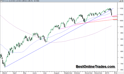
  • The SP500 has broken decisively the very long bull market up trendline that has been in force since March of 2009.  This was the high angle up trendline that has defined this bull trend and it was broken very decisively with a wide price spread and very high volume especially in comparison to volume levels of the last month or two advancing rally.
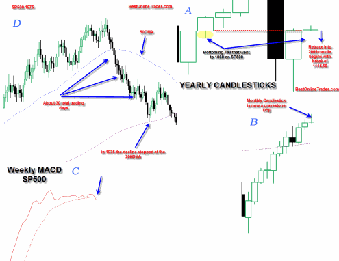
  • The WEEKLY MACD has finally confirmed a bearish downside crossover today which means that now the price trend should transfer to a “3 steps down 2 steps up” type action.  I have mentioned the weekly MACD many other times in previous posts and each time it looked like it was going to do a bearish cross, it them reversed and stretched itself out and evaded the sell signal.  But this time it failed to evade the sell in a big way especially when you consider the heavy volume and wide price spread to go along with it.
  • The Monthly January 2010 candlestick bar on almost all major indices has now transformed into a very bearish looking reversal hammer ( which implies that February will likely see the majority of the most devastating downward price action).
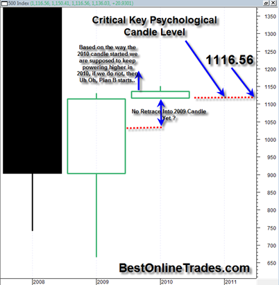
  • The YEARLY 2010 candlestick has now transformed into similarly very bearish looking gravestone doji.  The yearly 2010 candle now very clearly to me is saying the market wants to do some price retrace down into the 2009 candle.

Those are the main points that give me confidence on this trend change.  Now onto the charts…

Read more

Did you Know this Fact about the SP500 ?

Of all things technical analysis, I also enjoy pondering the longer term charts.  They cannot really be traded on, but they kind of give you this ‘I am the captain of this ship’ type feeling.  The other nice thing about them is they help to filter out all the shorter term ‘trading noise’ that exists in the shorter time frames.

I don’t look at the super long time frames that often but I usually do when the calendar changes to a new week, month, quarter or year.

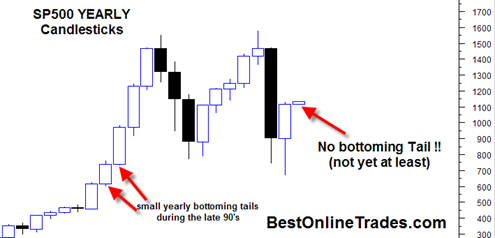
The fact I am talking about on the SP500 in the title of this article is that the current YEARLY OPENING PRICE is exactly equal to the current YEARLY LOW price.  I had mentioned this one other time before but it is worth mentioning again because in terms of candlestick analysis it is very important.

I am embarrassed to admit that only until recently have I started using candlestick charts exclusively.  I was using regular bar charts for the longest time and never really shook the habit.  Perhaps I was just stubborn.  But I can tell you with zero doubt that understanding the basics of candlestick analysis, patterns and psychology behind the candles and their structures and patterns will give you a very significant trading advantage over the longer term.

The best book on Japanese Candlesticks (of which I have a copy) is Japanese Candlestick Charting Techniques by Steve Nison. It is really well written and provides a huge amount of charting examples to clearly see candlesticks in action and their expected outcomes.

So back to my point about the opening price of the current year 2010 being exactly equal to the low price for 2010.  The actual value for the low and opening is 1116.56 according to my price data (I am assuming that my price data is all correct here otherwise some of the conclusions I make here slightly less meaningful).

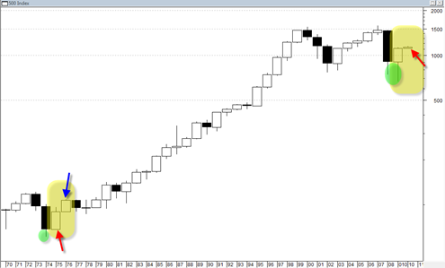
According to my data there was only one other year in the SP500 where the yearly open was exactly equal to the yearly low since 1969.  There are pointed out in the chart below with the two red arrows.

Read more

Origin Agritech SEED Setting up for Potential Breakout Into Earnings Tomorrow

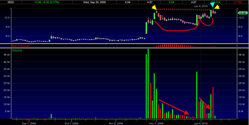
SEED is a Chinese Agricultural Company and it has a very bullish looking chart structure both in terms of volume and price action over the last few months.  Earnings are coming out tomorrow morning and it is going to be interesting to see whether or not the technicals are able to confirm a possible positive … Read more

Financial Stocks hit One Out of the Ball Park

Shitibank Shirt

For months on end there has been lots of bashing and negativity on the financial stocks.  Uncertainty and fear and anger over the unjust billions lost and sloshing around in that sector has turned a lot of mainstream opinion quite negative on this sector.

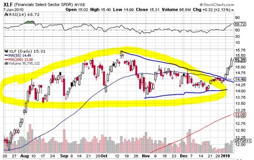
From many trader’s perspectives I believe this was also the case.  For every positive story I read or heard on the financials stocks it seems there were at least 4 that were negative in terms of fundamentals or technicals.  I must admit I also have had a bearish take on the large and somewhat lengthy broadening topping pattern in the XLF financials ETF. 

It was hard to get bullish on this large pattern because it seemed to be  not only a rounding topping pattern but also a very bearish broadening topping pattern.  I tried shorting the XLF a couple times towards the end of 2009 with very meager results.  I remember sitting in those trades all excited about a huge expected break down.  But then I also remember total frustration at how the XLF time and time again just would not break support or get enough selling power to cause some real trend breaking type moves.

Read more

AXL American Axle & Manufacturing Holdings Poised for Breakout

AXL has a very nice large pattern in the form of an inverse head and shoulders bottom.  This is a high reliability pattern and it is occurring over a time frame of 1.5 years which makes its breakout implications very significant. The right shoulder portion of the pattern has a saucer or scalloping type formation … Read more

The Stock Market Will go Up in a Straight Line in 2010

I am kidding of course, but I had to write a catchy title for this post given how we are starting the first day of the new year in the market.  I find it very significant that we ended the 2009 YEARLY price candle only inches away from the high of the YEAR.  And now on the first trading day of the YEARLY 2010 price candle we are in a gap and go situation.  That is an extremely bullish type of candlestick behavior because it does not create any ‘bottoming tails’ on the lower portion candle.

It is true that we can still see some type of selling the next week or two that will create

So far at least we see a huge sign of strength today across the board.  Even the financials (XLF) are rallying after that very long consolidation pattern which could have been seen as a major topping pattern.

Obviously I was stopped out of my TZA position this morning.  And at this point I have decided not to go short again later this week.  In fact I am looking for long side opportunities again. 

One just has to respect the bullish tendencies of this market.  So I think finding long opportunities is the early game plan again for now.  But at the same time being aware that bullish sentiment readings are at record levels and make the long trade a very crowded type of trade.

sp5002010104

Read more