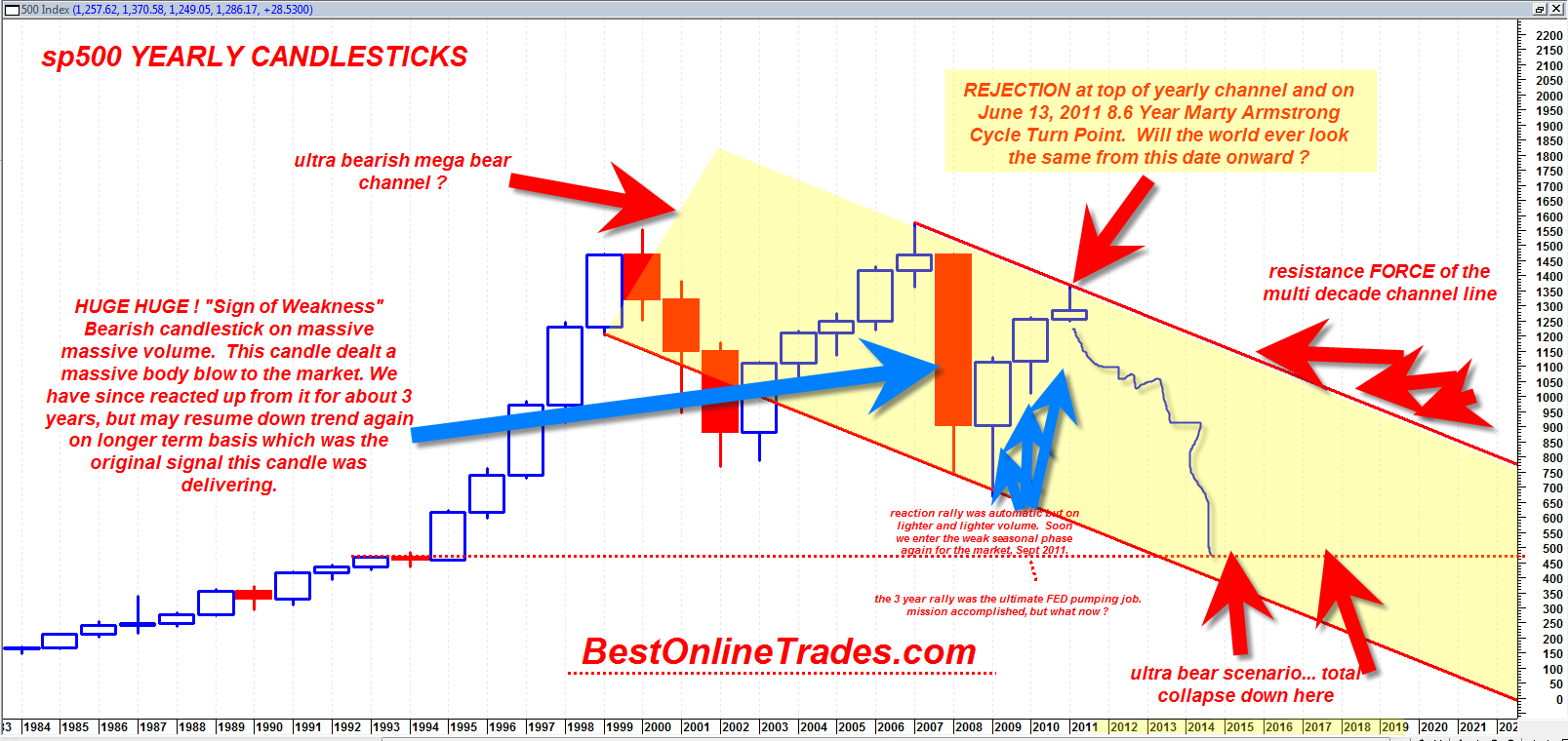
The chart you are about to see below may be one of the most important sp500 charts I have ever created with possible dramatic implications for the next 5 to 10 years. This long term chart is much different than the other longer term multi year charts because this one shows a down trending channel. My previous multi year chart shows a massive horizontal channel which is still valid. But the horizontal multi year channel implies a simple trading range instead of a mega bear channel.
The very long term chart of the sp500 on the yearly basis shows that there exists the possibility that we are not hitting the top portion of a mega yearly channel right on the Marty Armstrong Cycle turn date and that this turn could mark the beginning of a multi year down move back to the bottom of the channel.
If true then it would put the sp500 eventually near 450 by 2016? That is an extremely rough guess.


